

ES Projects: From Ground Up to Digital Presence
When ES Projects, a Hawke’s Bay-based landscaping and building specialist, approached us, they were masters of their craft but lacked a visual identity to match the quality of their work. As a small business starting with a blank canvas, they needed a brand that felt local, dependable, and modern.
The Challenge
The client had no existing branding or digital footprint. We needed to translate their "hands-on" expertise into a cohesive brand language that would resonate with homeowners looking for premium outdoor transformations.
The client had no existing branding or digital footprint. We needed to translate their "hands-on" expertise into a cohesive brand language that would resonate with homeowners looking for premium outdoor transformations.
Our Solution
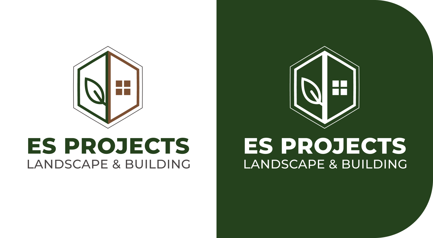
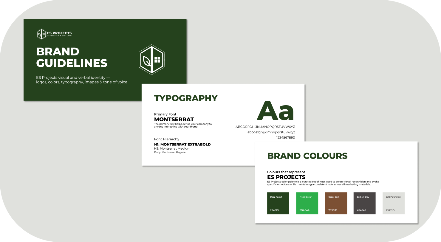
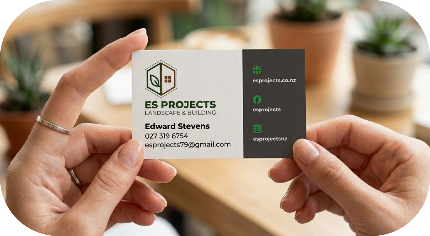
Brand Identity: We developed a clean, structural logo featuring an integrated house and leaf icon, symbolizing the harmony between construction and landscaping. The forest green and white color palette was chosen to reflect the natural environment of Hawke's Bay while maintaining a professional, "high-vis" clarity.
Web Design: We built a streamlined, conversion-focused website designed to take the guesswork out of the customer journey. By prioritizing high-quality imagery of their local projects and clear "Free Quote" calls to action, we transformed a simple service into a premium digital experience.
Strategic Messaging: We leaned into their "Built for Locals" ethos, ensuring the copy felt approachable yet authoritative, highlighting their commitment to taking the stress out of home renovations.
The Result
A professional, cohesive brand that gives a small business the "big company" polish required to win larger contracts and build lasting trust within the community.